

Branding for Jewish Community
If you give a man a fish, you feed him for a day.
If you teach a man to believe in stereotype, you feed him for a lifetime.
© PUNKS Wisdom

Religious Jewish community. What associations do these words evoke? Questions, suspicions and stereotypes? Or approval and understanding?


All things we don't understand is that we are start to be afraid. And then we start to move away from this. In the case of the Jewish Community, the information gap could lead to the degeneration of the nation.
What are the PUNKS doing? We build bridges and make the connections. Now we will tell and show how.

By 2021, the processes of assimilation and the moral and technical revolution have done their dangerous public work. Young Jews do not understand why the Community is needed, and how to get into it at all? The connection is lost, there are no guilty ones – it's just need to take it and correct the situation.
This is not a formality. For Jews, this is an acute national issue that is resolved at the level of chief rabbis and influential persons of government. The case of preserving the nation.
Previously, the leadership of the Community tried to act tactically, to create interest through short-term benefits. Events, seminars and course announcements worked, yes. But they did not solve global communication problems. The community remained closed and inaccessible.
We did some structural research and came up with a clear correct “Jewish mastermind” strategy. The brand will teach what the Jewish nationality gives, what the strength and potential of the Community is.

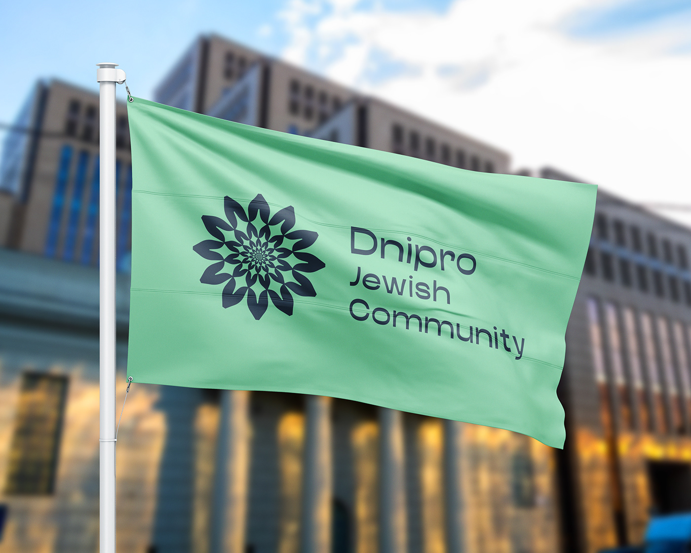
In the design system, we have combined two images: "charge of energy, vital force" and "unity, wholeness of the organism".

The main element of the logo is a flower with 12 petals. By analogy with the twelve tribes of Israel, 12 precious stones in the Breastplate of the High Priest. The number 12 carries the sacred meaning of the unity of the Jewish people.
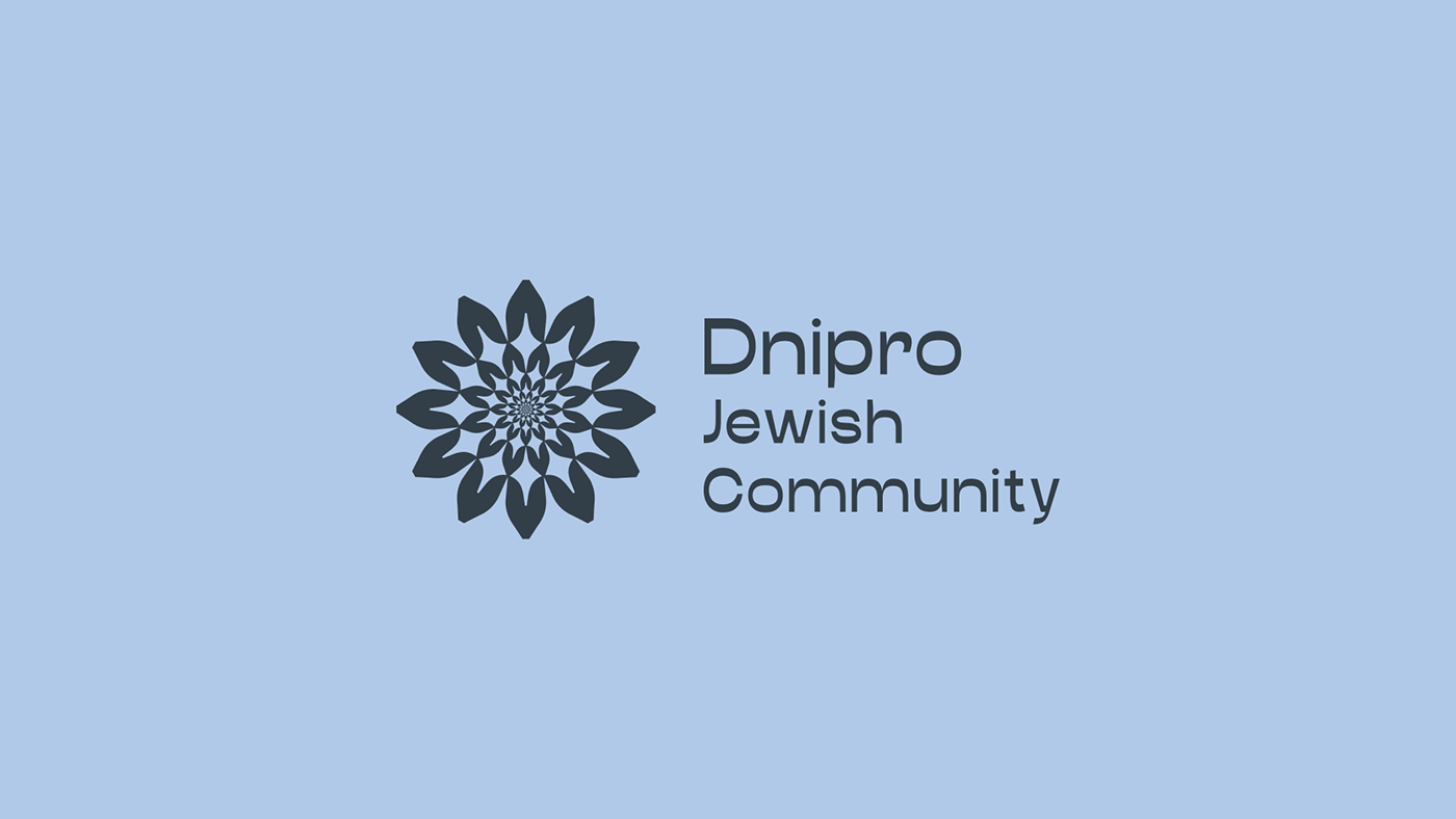
The logo consists of many levels. In each subsequent level of the drawing, its own likeness is fractally reproduced. This creates a sense of movement through the principle of form inheritance.
The endless idea expressed visually symbolizes the national and cultural unity of the Jewish Community


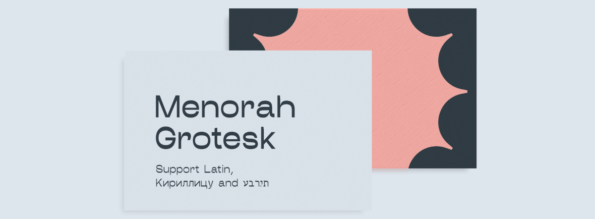
Menorah Grotesk, accent font. We created it through constant reviews with people for whom Hebrew writing is about more than typefaces and serifs.
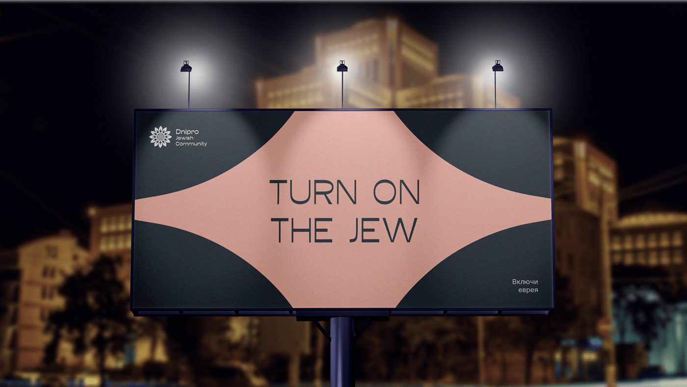
We heard the final "yes" from the respected rabbis of Dnipro and Israel.


Thanks for watching and be Punks!
Strategy Development — Bogdan Popovich, Artem Deringer, Anya Borisenko
Project Management — Artem Shlyapin
Creative Direction — Anya Borisenko
Art Direction — Dmitriy Dug
Graphic Design — Nastya Sribnyak
Illustrations, Design — Elizabeth Slyusar
Editor, Copyright— Grisha Misilyuk
Project Management — Artem Shlyapin
Creative Direction — Anya Borisenko
Art Direction — Dmitriy Dug
Graphic Design — Nastya Sribnyak
Illustrations, Design — Elizabeth Slyusar
Editor, Copyright— Grisha Misilyuk


